Introduction
The Architecture of Digital Empathy
In the modern digital economy, the quality of a product is no longer judged solely by its technical capabilities or feature list. It is judged by how it makes the user feel. We have entered an era where design is the ultimate competitive differentiator. User Interface (UI) and User Experience (UX) Design are the twin disciplines that bridge the gap between cold, complex code and intuitive, seamless human interaction.
While often grouped together as a single term (“UI/UX”), they are distinct, albeit deeply intertwined, fields. UX is the analytical, psychological, and structural foundation of a product—it focuses on the user’s journey to solve a problem. UI is the visual, interactive, and sensory execution of that journey—it focuses on how the product looks, feels, and responds.
This comprehensive guide will dissect the fundamental differences between these disciplines, explore the deep cognitive psychology that governs human-computer interaction, outline the core methodologies of modern product design, and examine how emerging technologies like Artificial Intelligence and Spatial Computing are fundamentally rewriting the rules of digital experiences.
2. The Evolution: From Command Lines to Spatial Computing
To master modern UI/UX design, it is essential to understand how human-computer interaction has evolved. The history of interface design is a continuous journey toward reducing “cognitive friction”—making technology feel like a natural extension of human thought.
The Command Line Interface (CLI) Era (1970s – 1980s)
In the early days of computing, there was no “design” in the visual sense. Users interacted with mainframes via Command Line Interfaces (like MS-DOS). The cognitive load was entirely on the user; to operate the machine, one had to memorize strict, unforgiving syntaxes and type them manually on a black screen. The technology was powerful, but accessible only to engineers and specialists.
The Graphical User Interface (GUI) Revolution (1980s – 2000s)
The turning point in digital design occurred at Xerox PARC and was later popularized by the Apple Macintosh in 1984. The GUI introduced the “desktop metaphor”—using visual icons (folders, trash cans, files) and a mouse to navigate. This was a monumental leap in UX. Instead of requiring users to recall commands from memory (Recall), the GUI allowed users to simply recognize options on a screen (Recognition). This lowered the barrier to entry, bringing computing to the masses.
The Mobile and Touch Era (2007 – Present)
The launch of the iPhone in 2007 radically altered both UI and UX. The mouse was replaced by the human finger. This necessitated entirely new design paradigms: buttons had to become larger (to accommodate the “fat finger” problem), interfaces had to become responsive to different screen sizes, and gestures (swipes, pinches, long-presses) became a primary mode of interaction. This era also introduced “flat design,” stripping away the heavy gradients and drop shadows (skeuomorphism) of the early 2000s in favor of clean, minimalist, content-first interfaces.
The Spatial and AI Era (2020s – Beyond)
Today, we are moving beyond flat glass screens. Voice User Interfaces (VUI) like Alexa, Spatial Computing interfaces like the Apple Vision Pro, and Generative AI interfaces (like ChatGPT) are requiring designers to think outside the 2D grid. The modern designer must now consider 3D depth, voice tone, conversational pacing, and predictive algorithms that anticipate a user’s needs before they even click a button.
3. UI vs. UX: Deconstructing the Disciplines
Though frequently combined into a single job title, UI and UX are distinct roles requiring different mindsets. A product can have a beautiful UI but a terrible UX (like a gorgeous sports car with no steering wheel), or a brilliant UX but an atrocious UI (like Craigslist—highly functional, but visually outdated).
| Feature | User Experience (UX) Design | User Interface (UI) Design |
|---|---|---|
| Primary Focus | Logic, Structure, Flow, and Problem Solving. | Visuals, Aesthetics, Interactivity, and Brand Expression. |
| Key Deliverables | User Personas, Journey Maps, Wireframes, Information Architecture. | High-Fidelity Mockups, Design Systems, Typography, Animations. |
| The “Question” | “How do we make this task as easy and frictionless as possible?” | “How do we make this interface beautiful, accessible, and responsive?” |
| Mindset | Analytical, empathetic, research-driven, and psychological. | Creative, detail-oriented, artistic, and pixel-perfect. |
4. The Core Pillars of UX Design (The Invisible Architecture)
Great UX design is invisible. When it works perfectly, the user doesn’t even notice it; they simply achieve their goal effortlessly. Building this invisible architecture requires a rigorous, research-based methodology.
4.1. User Research and Empathy
UX begins not with a canvas, but with a conversation. The goal is to deeply understand the target audience, their pain points, and their behaviors without projecting the designer’s own biases onto them.
- Quantitative Research: Data-driven methods like surveys, analytics review (examining bounce rates and drop-off points), and heat mapping to see *what* users are doing.
- Qualitative Research: Human-driven methods like 1-on-1 user interviews, ethnographic studies, and focus groups to understand *why* users are behaving a certain way.
- User Personas: Fictional archetypes created from research data that represent the core user segments (e.g., “Busy Professional Paul” or “Tech-Savvy Teen Taylor”). These personas guide decision-making throughout the project.
4.2. Information Architecture (IA)
Information Architecture is the science of organizing and labeling content so that it is easily findable and digestible. Imagine a library without the Dewey Decimal System—it would be useless. IA involves creating sitemaps, defining navigation schemas, and utilizing techniques like Card Sorting (where users organize topics into categories that make sense to them) to ensure the product’s structure matches the user’s mental model.
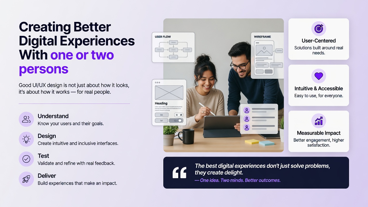
4.3. Wireframing and User Flows
Before adding color or typography, UX designers map out the skeletal framework of the product.
Mid-Fidelity (Mid-Fi): Digital wireframes linking screens together to create clickable prototypes, allowing designers to test the “flow” of a task (e.g., the checkout process on an e-commerce app).
4.4. Usability Testing
UX is an iterative process. Designers must validate their assumptions by putting prototypes in front of real users. Through moderated or unmoderated usability testing, designers assign specific tasks to users and observe where they stumble, hesitate, or fail. This data is then used to refine the wireframes before any expensive engineering or high-fidelity UI design begins.
5. The Core Pillars of UI Design (The Visual Execution)
Once the UX skeleton is validated, UI Designers bring the product to life. They apply visual language to communicate hierarchy, establish brand trust, and guide the user’s eye naturally across the screen.
5.1. Visual Hierarchy and Layout
Visual hierarchy is the arrangement of elements in a way that implies importance. A UI designer uses size, color, contrast, and negative (white) space to direct the user’s attention to the primary action (e.g., making the “Buy Now” button the most prominent element on the screen). Effective layouts utilize grid systems (like the standard 12-column grid) to ensure alignment, consistency, and responsiveness across mobile, tablet, and desktop screens.
5.2. Typography
Typography is often considered 90% of web design. UI designers must select typefaces that are highly legible on digital screens while conveying the brand’s personality. They establish a typographic scale (consistent sizing for H1, H2, body text, and captions) and manage line height, tracking, and contrast to ensure long-form reading does not cause eye strain.
5.3. Color Theory and Accessibility
Color is used to convey meaning (e.g., red for errors, green for success), establish brand identity, and create mood. However, modern UI design dictates that color cannot be the *only* way information is conveyed. Designers must adhere to strict accessibility standards (such as the WCAG guidelines), ensuring high contrast ratios between text and backgrounds so that users with visual impairments or color blindness can navigate the interface flawlessly.
5.4. Design Systems and Atomic Design
As digital products scale, maintaining consistency becomes a massive challenge. UI designers solve this by building Design Systems—comprehensive libraries of reusable components (buttons, input fields, modals), typography rules, and color palettes. Many modern teams use the Atomic Design methodology, created by Brad Frost. It breaks interfaces down into fundamental building blocks: Atoms (a single text input), Molecules (a text input combined with a search button), and Organisms (a complete header navigation bar). This ensures that a button looks and behaves identically on page 1 as it does on page 1,000.
6. The Psychology of UI/UX: Why We Click
A master UI/UX designer is, fundamentally, a behavioral psychologist. Every layout, color choice, and animation is designed to leverage human cognitive processing. Understanding these psychological laws is what separates good design from exceptional design.
Key UX Laws and Cognitive Principles
- Hick’s Law: The time it takes to make a decision increases with the number and complexity of choices. In UX, this means simplifying navigation menus and breaking complex forms into smaller, bite-sized steps to prevent user paralysis.
- Fitts’s Law: The time required to rapidly move to a target area is a function of the distance to the target and the size of the target. This dictates UI decisions like making call-to-action (CTA) buttons large and placing them in easily reachable areas on mobile screens (like the bottom edge).
- Cognitive Load: The total amount of mental effort being used in the working memory. Designers strive to reduce “extraneous cognitive load” by stripping away unnecessary visuals, jargon, and complex animations that distract the user from their primary goal.
- The Zeigarnik Effect: People remember uncompleted or interrupted tasks better than completed tasks. UX designers use this by showing progress bars (e.g., “Your profile is 70% complete”) to motivate users to finish an onboarding process.
- Gestalt Principles: A set of psychological rules describing how humans group similar elements, recognize patterns, and simplify complex images. For example, the Law of Proximity dictates that objects placed close together are perceived as a group, which guides how UI designers space elements in a form or dashboard.
7. Advanced Strategies and Emerging Technologies
The field of UI/UX is currently undergoing a massive paradigm shift driven by artificial intelligence and new hardware platforms. Designers must adapt to stay relevant.
7.1. Artificial Intelligence in Design
AI is transforming both the process of design and the product being designed.
- Generative UI: AI tools are now capable of generating wireframes, creating high-fidelity mockups from text prompts, and generating placeholder copy instantly. This allows designers to move from ideation to testing in minutes rather than days.
- Predictive UX: Interfaces are becoming dynamic. Using machine learning, apps can now predict user intent based on historical behavior, contextual location, and time of day, reorganizing the UI dynamically to present the most relevant information without the user having to search for it.
7.2. AR, VR, and Spatial Computing
With the mainstreaming of headsets like the Meta Quest and Apple Vision Pro, designers must learn to design for “Z-space” (depth) rather than just X and Y axes. UI in spatial computing involves volumetric elements, eye-tracking as a primary cursor, and hand-gesture recognition. Furthermore, designers must contend with physiological factors like motion sickness, ergonomic fatigue (“gorilla arm”), and peripheral vision limitations.
7.3. Voice User Interfaces (VUI)
Designing for smart speakers (Alexa, Google Assistant) or in-car voice systems requires stripping away the visual entirely. VUI design relies on conversational flows, error handling (what the system says when it doesn’t understand a command), and establishing a persona or tone of voice that aligns with the brand.
8. The ROI of Good Design
For decades, design was viewed as a superficial “paint job” applied at the end of software development. Today, it is recognized as a primary driver of business profitability. Excellent UI/UX design directly impacts the bottom line:
- Reduced Development Costs: Prototyping and testing designs with users before writing a single line of code prevents engineers from building features nobody wants, saving massive amounts of developer time and budget.
- Increased Conversion Rates: A frictionless checkout flow and a clear visual hierarchy directly increase sales, sign-ups, and lead generation.
- Reduced Customer Support Costs: An intuitive interface that clearly explains itself results in fewer frustrated users flooding support centers with help tickets.
- Enhanced Brand Loyalty: Users form emotional attachments to digital products that respect their time, protect their privacy, and delight them through thoughtful micro-interactions. A superior UX is the ultimate customer retention strategy.
9. Conclusion
UI/UX design sits at the beautiful intersection of art, technology, and psychology. As our world becomes increasingly digitized, the screens and interfaces we interact with dictate the quality of our daily lives. The ultimate goal of a UI/UX designer is not merely to create something that looks stunning on a portfolio, but to act as a fierce advocate for the end-user.
As we transition into an era of AI-driven, spatial, and voice-activated experiences, the specific tools and visual trends will inevitably change. However, the core philosophy of UI/UX—deep empathy for human behavior, rigorous problem-solving, and a relentless commitment to reducing friction—will remain the undisputed foundation of creating better digital experiences for the future.
Frequently Asked Questions (FAQ)